Introducing react-site-nav
Stripe has a beautiful site nav and this package is inspired by that. Introducing react-site-nav, a beautifully animated site nav powered by styled components and css animations. Play with the live demo powered by now or check out the video below.
Goal
Let's use react-site-nav and add a kick ass nav to create-react-app!
Step 1: Install
We'll create a new create-react-app project and install react-site-nav the usual way:
create-react-app cra-with-nav
cd cra-with-nav
yarn add react-site-nav
Step 2: Adding SiteNav and ContentGroup
Now we are going to add two components to App.js: SiteNav and ContentGroup.
import React from 'react';
import logo from './logo.svg';
import './App.css';
import SiteNav, {ContentGroup} from 'react-site-nav';
export default () => (
<div className="App">
<header className="App-header">
<img src={logo} className="App-logo" alt="logo"/>
<h1 className="App-title">Welcome to React</h1>
</header>
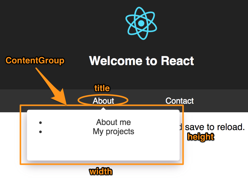
<SiteNav> <ContentGroup title="About" width="240" height="140"> <ul> <li>About me</li> <li>My projects</li> </ul> </ContentGroup> <ContentGroup title="Contact" width="200" height="150"> <ul> <li><a href="https://github.com/yusinto">Github</a></li> <li><a href="https://twitter.com/yusinto">Twitter</a></li> </ul> </ContentGroup> </SiteNav> <p className="App-intro">
To get started, edit <code>src/App.js</code> and save to reload.
</p>
</div>
);SiteNav is the root react component that contains ContentGroup children. Each ContentGroup can accept 3 props: title, width and height. abc
Step 3: Making it pretty
It takes only a few lines of code to get up and going, but it still looks very basic. Let's make it pretty! First, set our SiteNav to debug mode so the content group stays open when we hover over it:
<SiteNav debug={true}>Let's get rid of those ugly default list style, margin and padding:
ul {
    list-style-type: none;
    margin: 0;
    padding: 0;
}
Next instead of a bullet point, let's have an image next to our text. Our jsx becomes:
import aboutMeImage from './about-me.png';

  // ... other code omitted for brevity
  <ul>
    <li>
      <img src={aboutMeImage} height="40"/>
      <span>About me</span>
    </li>
  </ul>
Let's use flex for our list item so we can easily center everything:
li {
display: flex;
justify-content: center;
align-items: center;
height: 60px;
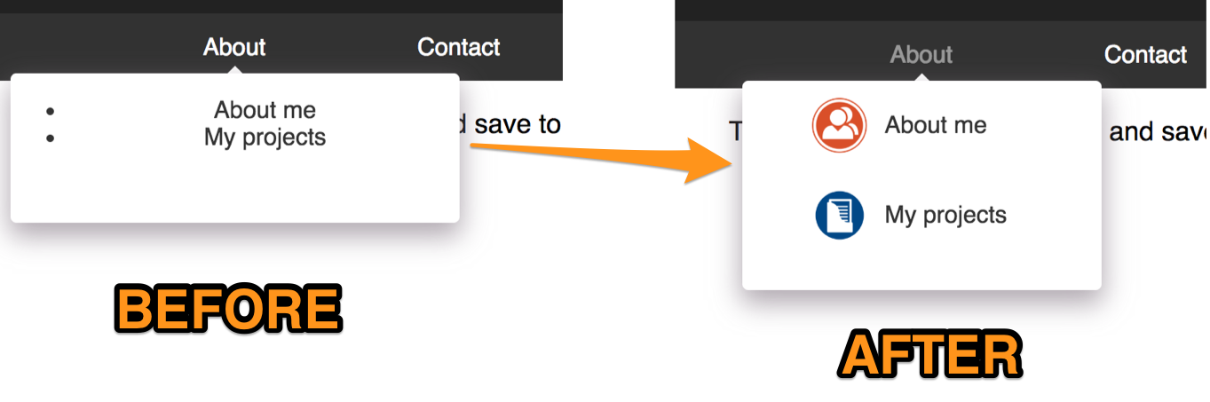
}It's starting to look good! Just some finishing touches now to make the images and text vertically aligned and some hover effects:
li:hover {
    opacity: 0.7;
}

li > span {
    flex: 0 0 100px;
    text-align: left;
    margin-left: 10px;
}
Final result looks like this:
Check out the live demo here. The complete stylesheet looks like this:
ul {
    list-style-type: none;
    margin: 0;
    padding: 0;
}

li {
    display: flex;
    justify-content: center;
    align-items: center;
    height: 60px;
}

li:hover {
    opacity: 0.7;
}

li > span {
    flex: 0 0 100px;
    text-align: left;
    margin-left: 10px;
}
Next steps
There are still loads left to do, like mobile. I'll get to that in time! For more, check out github. There are three fully working spas including the code in this blog in the examples folder. The code in this blog is under examples/cra-with-nav. Please star if you like it!
Thanks
Max Stoiber is awesome. Styled components is awesome. Now is awesome. Thanks.